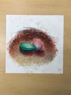
oil | chalk |
 |  |

Introducing the Piece:Inspiration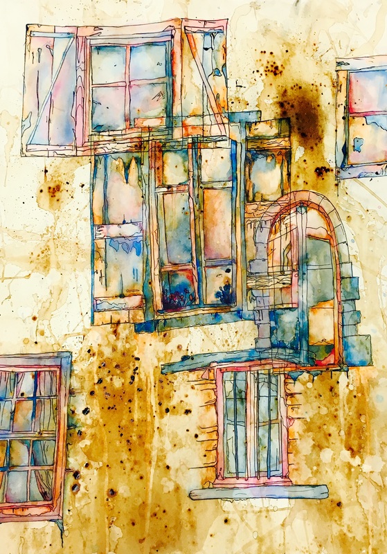 Originally, I had planned to do my contour drawing of an old trophy, but after several practices, it became apparent that it was far beyond my skill level. I had already decided on kind of an old/rustic theme and by chance, I happened to stumble across a picture of a beautiful old stone arch window (Middle right in the picture above) on google. I then decided I would make windows the subject of my piece. Also, since the beginning I had been set on the idea of doing a background stain with coffee. I liked the organic simplicity of it and the color was rich yet muted.
GoalsFor my piece, I had not specific goals, but I did want to, through my subject matter and choice of colors, want to convey a sense of comfort, familiarity and age. I used coffee as a background color because it was a soft and warm color. It was muted, yet still with a hint of vibrancy. Then, with my windows, I wanted to draw them as if they had been drawn for an old children's book. With black ink outlines and a kind of whimsical style. Finally, with my colors I wanted to make them somewhat realistic, but also kind of dreamy and surreal. Simply, I wanted the tone of my piece to be one of casual comfort and warmth. Why windows fascinate meTo fully understand this piece and why I chose windows as my focus, you must understand that I am drawn to the simple, utilitarian beauty of things like windows and doors. Through out my life I have traveled to many places, and everywhere I go I always make an effort to notice and observe the windows and doors. In Italy especially I feel that the windows have so much character, often colored and with a sense of age. I feel that windows can sometimes be so much more than what they are intended for. They exude character, age, comfort or a wide variety of different things depending on what kind of window you are looking at. Beautiful windows from around the worldThe creative Process:Significant artist choiceI think that the most important and most difficult decision I had to make during the process of creating my window collage is when I decided to use blue as one of the colors I would paint with. This made me very nervous because I had put so much effort into the coffee staining and contour drawing I really didn't want to ruin it. I decided to go with blue because I thought it would contrast nicely with the coffee and my other Two colors (Orange and yellow). I wanted to have both aa complimentary and an analogous color scheme in my composition. My analogous colors would be the coffee, yellow and orange, and my complimentary colors would be blue contrasting with the other colors. It was a big risk for me to decide to use blue as one of my colors but I think it turned out great. FeedbackA piece of feedback or comment I got on several occasions was to have more contrast between my colors. Some people said that it looked flat and it might look better if I went back over it and intensified the colors a bit. I took their advice, making the yellows more bright, the oranges richer and the blues darker. I even gave it another wash of coffee. I am really glad I got this feedback because I liked my piece much more after I had gone and made the colors richer. ChallengesThere were MANY challenged with this piece, but for the sake of brevity, I will only focus on a few. 1st challengeRight from the start, with my coffee staining, something did not go as expected. After I had stained my paper, I wanted to give it some texture by sprinkling some coffee grounds onto the still wet paper so they could bleed their color into it. instead, the coffee turned to goo and then hardened onto my paper. This was not especially disastrous, but I did have to work with large smooth bumps on my paper instead of the nice small points of color I had originally wanted. 2nd ChallengeYou may notice, if you look at the top right hand part of my picture, there is a large dark area. Well that was caused from an ink spill. I let a few drops of black India ink spill onto my paper and it created a large black spot. To clean it up I tried to use paper towel which only spread it around. Finally, I decided that I would use sand paper to rub the ink off. After I had done that, the ink was gone but so was the paint. I had to repaint over that area but because the paper was not much more rough and still had residual ink in it, it turned out much darker than the surrounding colors. I think it ended up ok and it might even add a bit of character to my piece. 3rd challengeThis challenge comes while I was painting with the watercolors. I am not the most tidy artist and I would often flick water onto my paper when I went to rinse my brush. I didn't realize that the water in fact washed the coffee out of my paper and I was left with dozens of small drop sized coffee less patches. I decided to embrace this and I dripped water down my paper in order to wash out the color as to add to the piece. You can see this if you look to the central window. Below the bottom left corner, there are light streaks running downwards. These are suppose to be where, because the windows are so old, the rain has washed out the color over time.
What I learned:A strength of my pieceI think that one of the strengths of my piece is that the colors are balanced and pleasing to the eye. Most of my effort in fact spent on this piece was on trying to get the colors right. I spent hours painting and adding small details of color where I thought I needed them. I think, to some extent, I succeeded in making the colors I chose work. What I learnedI think the main thing that I have learned by doing this project is that the structure of the composition is important. For my piece I decided to go with a chaotic, yet balanced arrangement of windows. the placement of some of my windows are is unorganized and chaotic, with some of the overlapping, but they are not all clustered up at the top of the page. I wanted to draw them distributed somewhat evenly across the page as to not leave any large unfilled areas but I did not want it to be uniform. Having an effective structure lets the eye more naturally move across the page which makes the viewing experience better.
Children's Classics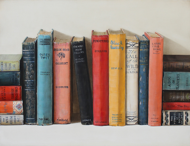 Materials:For this piece, Holly Ferrell used acrylic and oil paints. according to the Holly Ferrell Still life gallery it was painted on Masonite (a kind of hard board made from steam cooked or pleasure molded woods). Subject:For this painting, Holy Ferrell has decided to depict various classic and brightly colored children books standing against a wall. Some of their titles are Oliver Twist, The call of the Wind, Black beauty and many others. She has arranged the books in a way that is not messy enough to look unorganized but not perfectly organized either as to make the books feel casual. Some books are horizontal and some are vertical. All of them are strait except for the one in the middle (The wind in the Willow). Maybe she is trying to draw attention or convey something special about this book? Captivating?Although at first this piece of art may seem simplistic, its just a bunch of old books, the more you look at it the more you begin to observe the details. If you look closely, you can see the intricate titles and designs on the spines of the books which you might just glance over on your first look. another interesting detail is on the tops and bottoms of the books often the paper is faded, word or ripped. This shows that the books have been used a lot and have a long history Also, the colors of this composition are chosen expertly. They are balanced, they contrast one another. Ferrell's StyleThe more you looks at Ferrell's work, the more similarities you see between her different pieces. Each of them depict a object or objects that, by themselves are nothing special. A towel, children's books, toy cars, they are not extraordinary items. Furthermore, they are all painted with a similar style. She prefers to use lighter, muted an pastel colors. This choice of colors makes her art look soft and friendly. Holly also always draws her object with no background. It is either hanging on a wall of sitting on the floor, with the possible edition of a horizon line of where the wall meets the floor. The last similarity I will mention, there are certainly more, is that most of her pieces include a cast shadow. It is usually soft and not immediately noticeable but it is always there. Message The message that I have drawn from Ferrell's art is that everyday items are so often disregarded but if you were to actually focus on one, it becomes extraordinary. For example, in the slideshow above, the clock would not look special if she drew it and the surrounding room, but because they isolated it and made it the focus of her painting, we focus on it and fully appreciate it. This is true for many things in our houses. Any everyday item, an iron, a cup or a magazine is not anything special when seen with everything else in a house but if you look at it in isolation, it becomes captivating. My Holly Ferrell DrawingMaterialsFor my drawing, all I sued was a piece of paper from my sketch book and few pencil crayons. The main colors I used were yellow, grey, orange and blue. Other colors included, white, green, red, tan, brown and purple. I used orange and grey fro the base color and yellow and blue for the highlights and shadows, respectively. SubjectI decided to draw, for my piece, a role of paper towel. I chose this item because I liked the curves and shapes of an object like this. I also chose it because I feel that people take things like this for granted. Paper towel is actually quite a sophisticated from of paper, double layered, light and absorbent and I thing that very few people ever consider that. To most people it is just something to clean up messes. 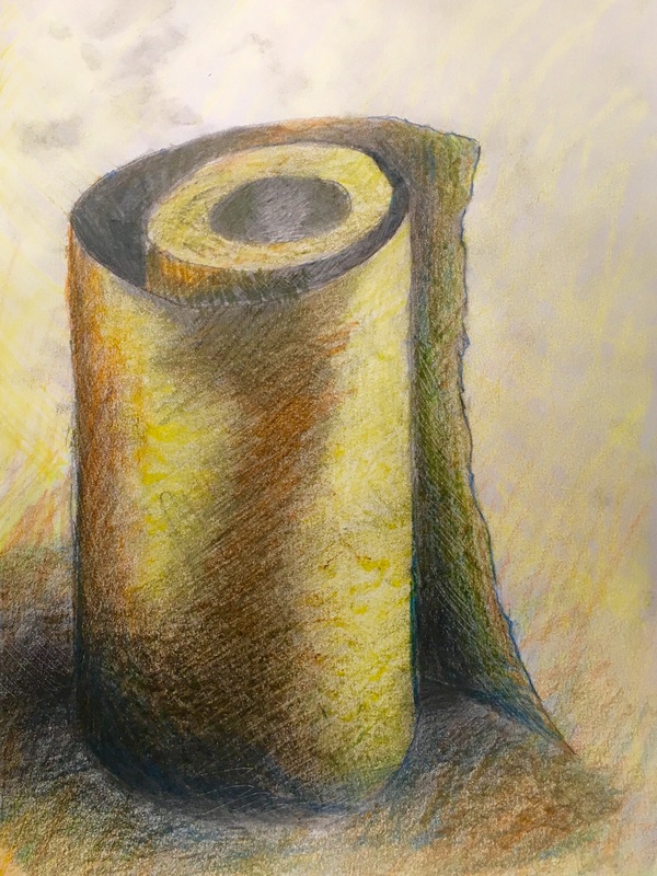 SummaryFor my project I am doing several drawings of old windows on top of a piece of Stonehenge paper heavily stained with coffee. At first I thought I would draw an old swimming trophy on top of the same paper staining technique but I later realized that this would be too difficult. It was too difficult to draw the human figure standing on the trophy accurately therefor I moved to a less challenging object, a window, InspirationOriginally I was inspired to stain my paper with coffee by images like these... I thought they looked old and rustic and would lend themselves nicely to a drawing of an antique trophy. Since I abandoned the idea of drawing a trophy, I chose old windows because I was committed to the "old" theme. Subject matterAfter I decided to draw windows, I browsed google until I found a selection that I thought I could draw well and that would look good. MediumTo make my project, I am obviously using coffee for the staining, but I am also using black ink for my lines and will be using water color paint for when I add color. During the staining process, I also used coffee grounds to add dark specks to the paper. Finally, also during the staining process, I used a paint brush to spread the coffee around and achieve the staining I wanted. ProcessI never really had a clear plan of action for my drawing. I feel that the best art does not come from an exact plan. For the staining portion, I just washed, soaked and splattered my paper with coffee until I was satisfied. Then I let it dry on one of the art tables until the next class. When I got to the drawing, I wanted to draw my windows in the broken contour style. I just drew windows where ever I thought that would give balance but also look random. I didn't want to over lap too much because each drawing is very complex and overlapping would just make it a mess of black lines. I did start with a big window in the middle, but after that I just added them at random around the edges. ProgressCurrently, I have finished the steps of staining my paper and drawing my windows. Unfortunately I did not get a photo of my paper pre drawing with only the coffee stains. Anyways, here is what I've done so far. (I may have edited the first one a bit) The futureI think I wall paint over my windows with a light blue grayish water color. I think because orange and blue are complimentary, the blue would contrast with the orange making the coffee color more vivid. It would also look like dirty glass and would therefor be realistic.
|
AuthorWrite something about yourself. No need to be fancy, just an overview. Archives
February 2016
Categories |


 RSS Feed
