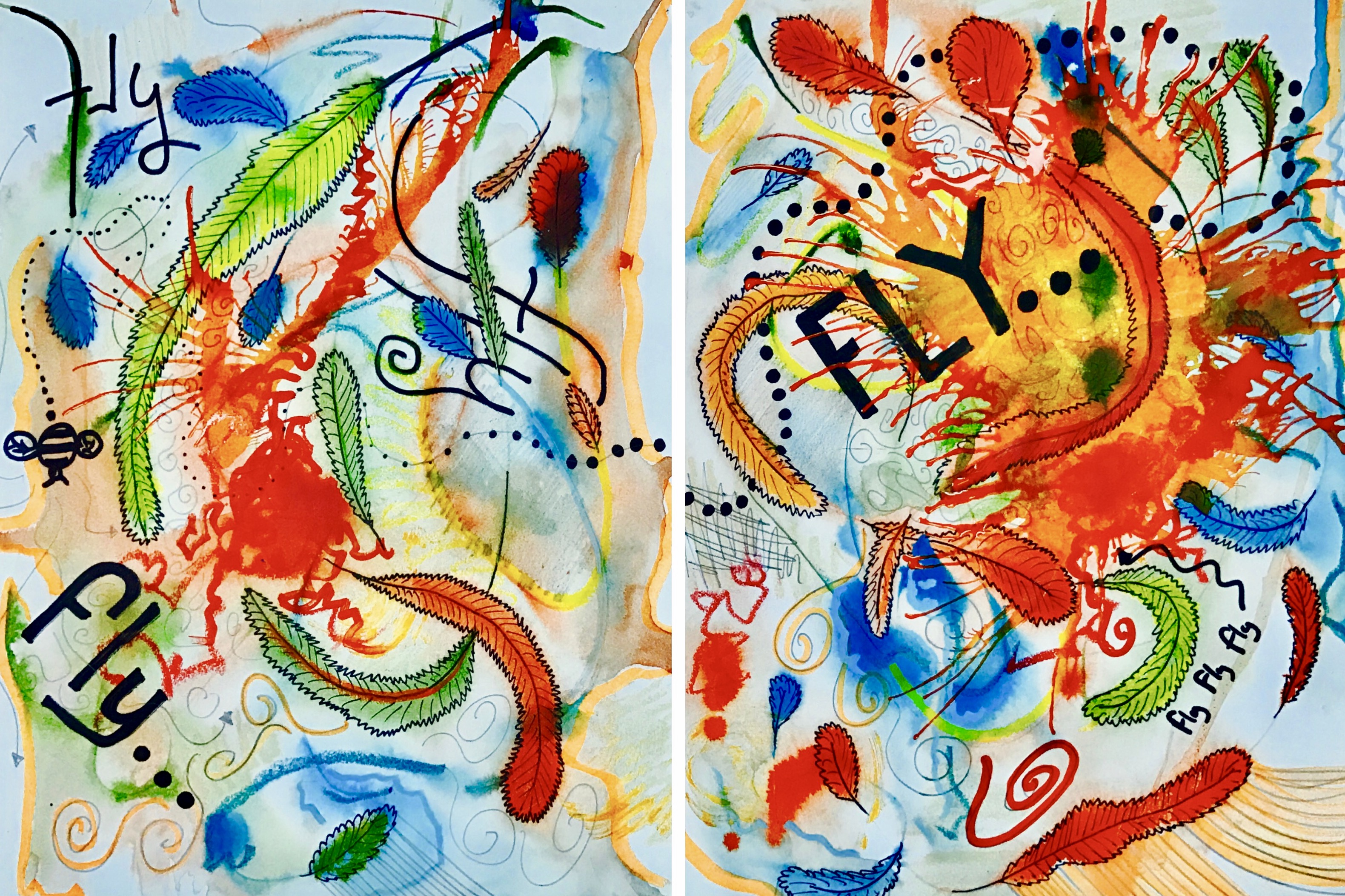
Flight:

 SuperficialReflection:
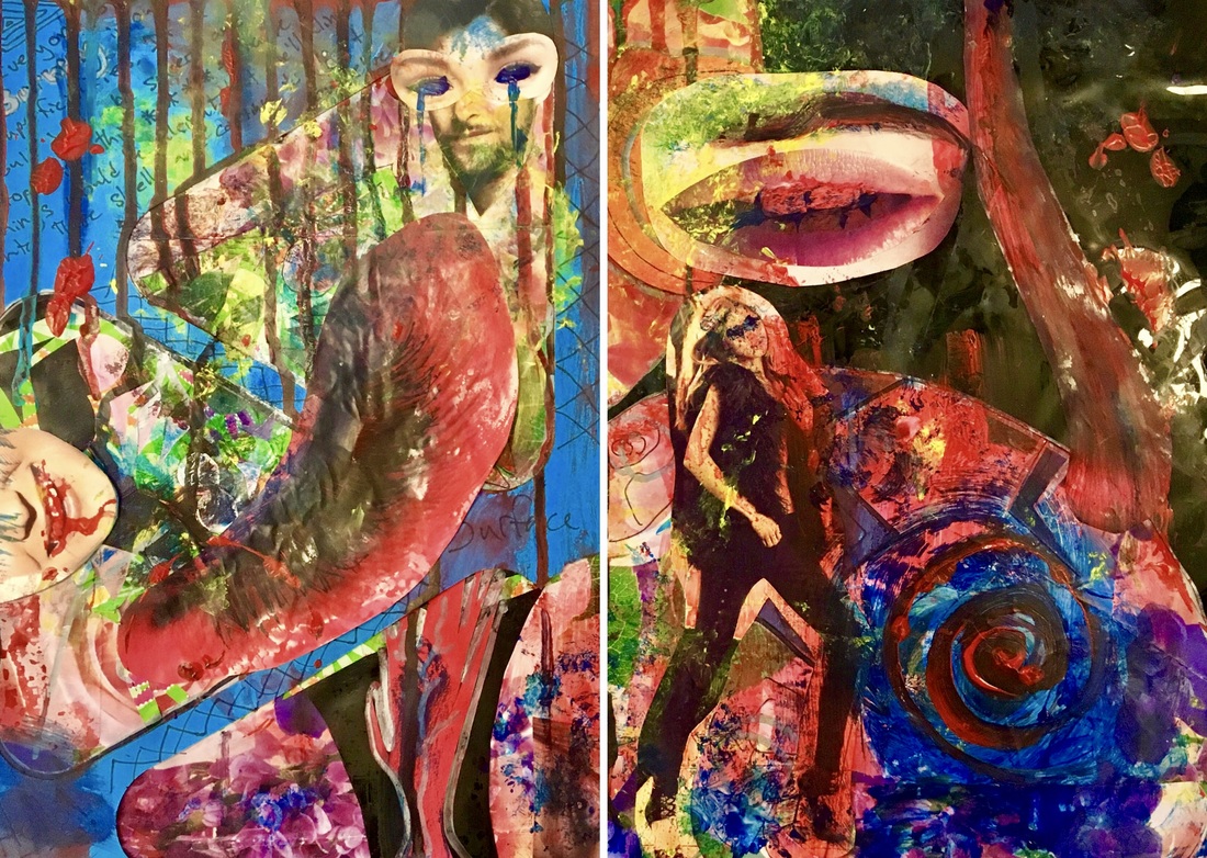
This piece to me could have turned out better. I like my over-all theme and color scheme, but in the final stretch of its making, it got a bit messy and careless. This was, to some extent, intentional because I wanted to convey the messiness and imperfection we keep hidden inside ourselves and bring it, in the form of paint, to the surface. Despite its sloppiness however, I do think that its style is interesting. It makes use of primarily collage and acrylic and has layer upon layer of color. I took many cuttings from magazines of anything that I thought could relate to the word “Superficial”. I then altered them with paint and ink to distort their look. Through this I hoped to convey the hidden aspects of ourselves that we keep hidden behind a mask of aesthetics. In the future, I will endeavor to put more care into my work, however despite this, I think I am happy with this piece. 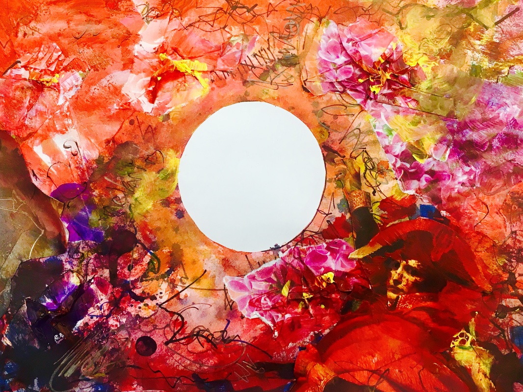 ClarityReflection:
This piece is meant to convey clarity through contrast. The chaos around the circle is meant to make the white area stand out and seem pure and clear. I accomplished this my laying down tape in a cross hatch pattern on a cutting mat then, with an exacto-knife, cutting a circle out. I then stuck it in the center of my page and made a mess all around it. I think this piece is very successful because it makes use of many different mediums, such as water color, collage, ink, acrylic, Prisma colors and many more. I also like the color scheme because, so me, red signifies dangerous beauty or chaos. Furthermore, I think the idea of clarity through contrast is novel and interesting. Over all I think that this piece, because of its use of many different mediums, the idea behind it and its color scheme and composition, is quite successful and pleasing to the eye. |
 RSS Feed
